
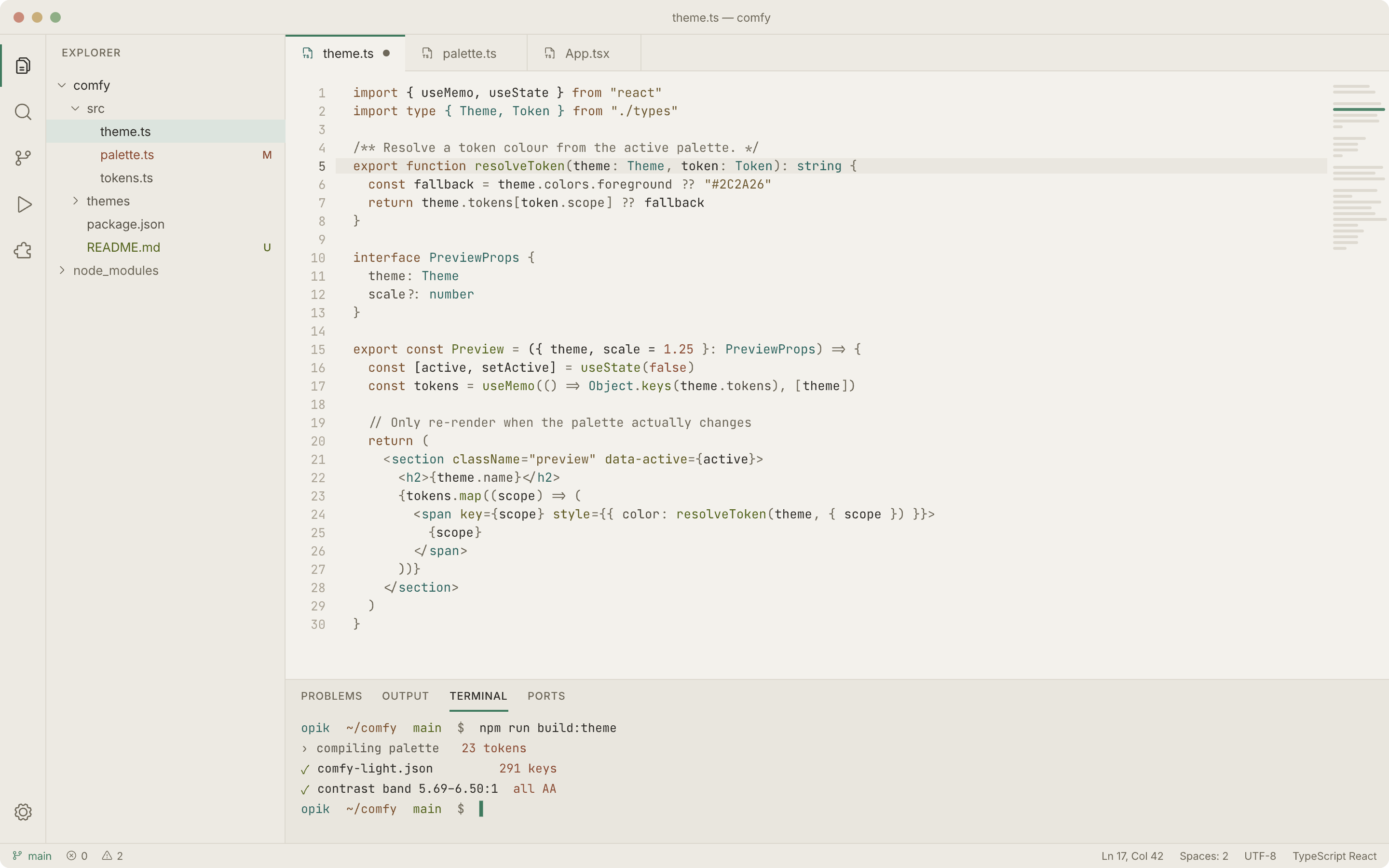
A theme designed for staring at, not for screenshots. Two variants, Comfy (light, the default) and Comfy Night, both generated from one palette.
Most themes are designed by picking colours that look good next to each other. This one was derived from vision research, then verified numerically before a single frame was drawn.
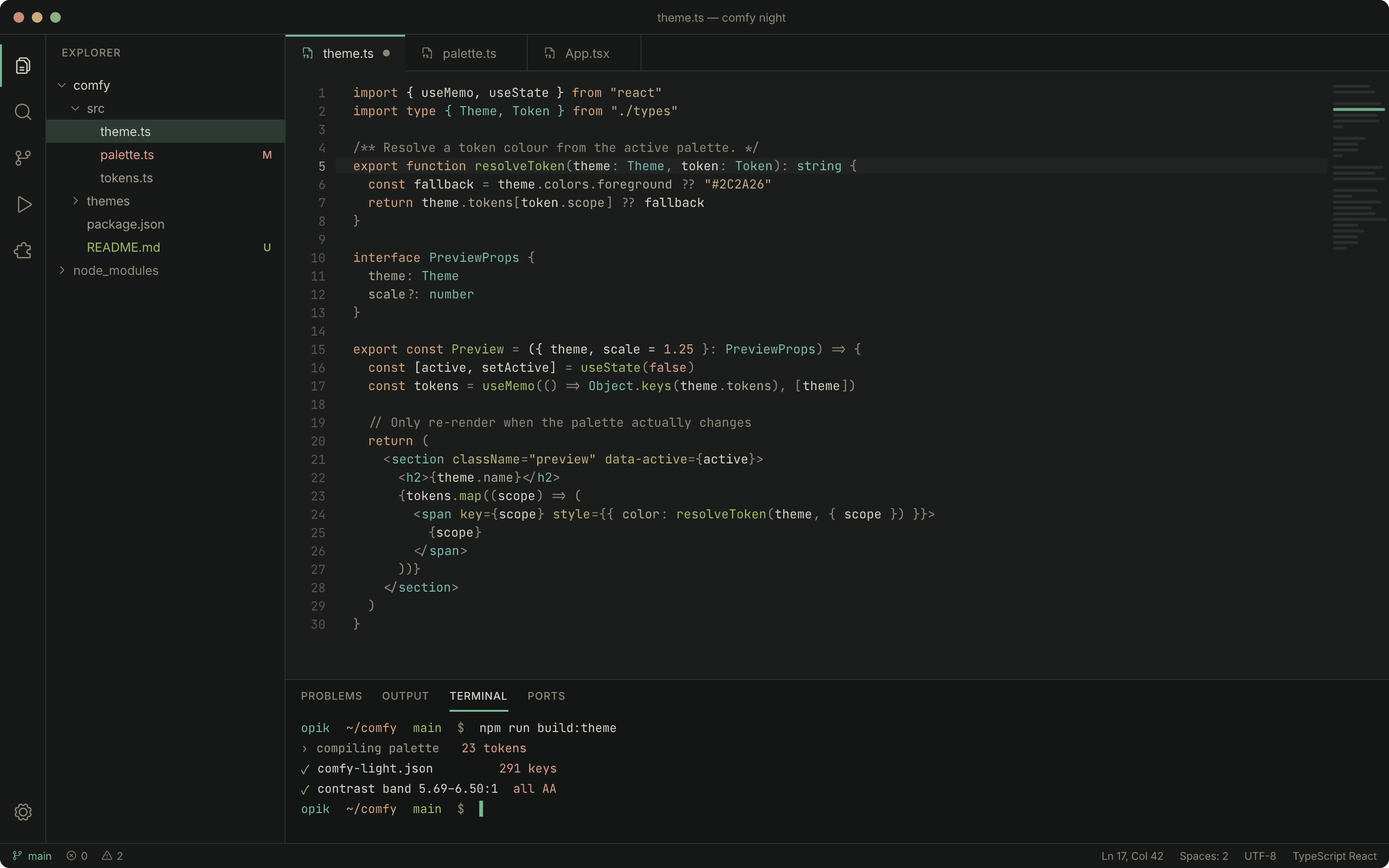
Comfy Night, for dim rooms and eyes that prefer it:
The integrated terminal carries the same 16-colour ANSI set in both variants:
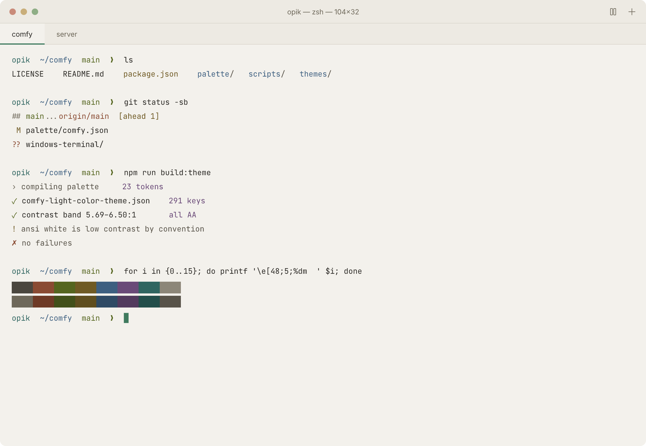
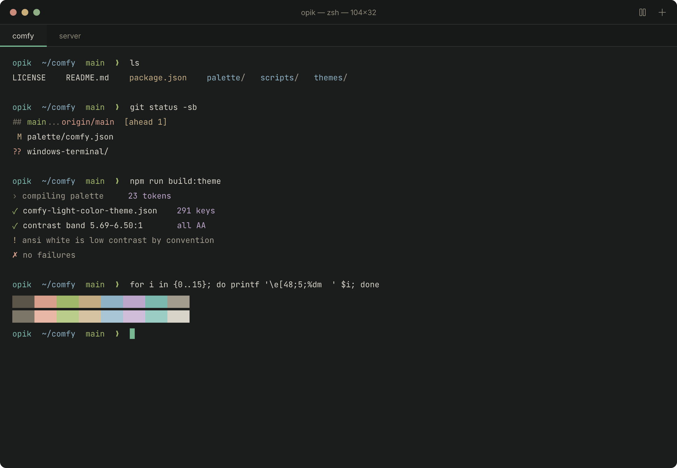
Light is the default. Positive polarity — dark text on a light ground — constricts the pupil. A smaller aperture means greater depth of field and less spherical aberration, so most eyes resolve small text with less accommodative effort. Reading studies have found this repeatedly, and the advantage grows as font size shrinks. Comfy Night exists for cataracts, photophobia, migraine, and dim rooms, where the opposite holds.
Every coloured token sits inside a contrast band, not a hierarchy.
| Light | Dark | |
|---|---|---|
| Coloured tokens | 5.69–6.50:1 (spread 0.80) | 7.31–7.71:1 (spread 0.40) |
| Comment / punctuation | 4.91–5.14:1 | 4.74–4.99:1 |
| Primary text | 12.69:1 | 11.45:1 |
When tokens differ sharply in luminance, the eye re-adapts on every saccade across a line. Holding them within half a point means hue distinguishes category while brightness stays flat. Nothing pulls your eye; you read the code, not the colours.
No saturated short-wavelength blue in syntax. Longitudinal chromatic aberration leaves ~440nm roughly one dioptre defocused while accommodation locks near 550–570nm, and S-cones are absent from the foveal centre — so there is no high-resolution blue channel at all. Saturated blue punctuation is permanently, slightly out of focus. Cool tokens use teal near 490nm instead. The ANSI blue slot is mandated by the spec, so it is shifted to hue 200–210 and held low in saturation; it remains the weakest colour optically and there is no way around that.
Neither extreme. No #000, no #FFF. Primary text lands near 12:1 rather than 21:1,
which removes halation — the glow around light text on dark that is worst for the roughly
one in three adults with astigmatism — without dropping near the 4.5:1 floor.
Comments clear 4.5:1 in both variants. Most themes fail this. Dimming comments aids scanning, but not below the point where they stop being readable.
Marketplace
Cmd/Ctrl+P, then:
ext install opik.comfy
From source
git clone https://github.com/opikdev/comfy-vscode-theme
ln -s "$(pwd)/comfy-vscode-theme" ~/.vscode/extensions/opik.comfy-0.1.0
Reload the window, then Cmd/Ctrl+K Cmd/Ctrl+T and pick Comfy or Comfy Night.
Works unchanged in Cursor, Windsurf, and VSCodium — swap the target directory for
~/.cursor/extensions/ or ~/.windsurf/extensions/.
| Role | Hex | Token | Hex | |
|---|---|---|---|---|
| Background | #F3F1EC |
Keyword | #7B5230 |
|
| Chrome | #EDEAE3 |
Type, tag | #2F6560 |
|
| Panel | #E9E6DE |
Function | #55651F |
|
| Border | #DCD8CE |
String | #6E5A33 |
|
| Text | #2C2A26 |
Number | #8A4B33 |
|
| Muted | #6E685A |
Attribute | #5F5A22 |
|
| Accent | #3F7A5E |
Constant | #6A4A78 |
| Role | Hex | Token | Hex | |
|---|---|---|---|---|
| Background | #1B1D1C |
Keyword | #D2A07C |
|
| Chrome | #171918 |
Type, tag | #7CB8AE |
|
| Panel | #141615 |
Function | #A1B76A |
|
| Border | #2E312F |
String | #C3AC84 |
|
| Text | #D8D4CA |
Number | #D89F8C |
|
| Muted | #8D8778 |
Attribute | #B5AD78 |
|
| Accent | #78B894 |
Constant | #BCA6CA |
Dark-variant saturation is capped at 18–42% against 38–69% in light, because colours read hotter on dark grounds.
The single largest comfort factor is not the theme. ISO 9241-303 puts it on matching display luminance to the room — roughly 80–100 nits in dim conditions. A perfectly tuned palette on a 400-nit screen at midnight will still hurt.
Never edit themes/*.json. Change palette/comfy.json, then:
npm run buildThe build regenerates both variants and fails if any colour drops below 4.5:1 or the ink band spreads wider than 1.5 points. The guard is the point: it makes the research enforceable rather than aspirational.
MIT