
Responsive layouts for React Native that keep up with rotation and window resizing. You get named breakpoints, a mobile-first select(), font scaling with sensible limits, wp/hp percentages and size-matters style s/vs/ms/mvs scaling, all from one hook.




import { createResponsiveStyles } from 'react-native-responsive-hook';

const useStyles = createResponsiveStyles(({ wp, select, fontSize }) => ({
  card: { width: wp(90), padding: select({ xs: 12, md: 24, default: 12 }) },
  title: { fontSize: fontSize(18) }, // scales with the device, capped for tablets
}));

function Card() {
  const styles = useStyles(); // recomputed on rotation, stable otherwise
  // ...
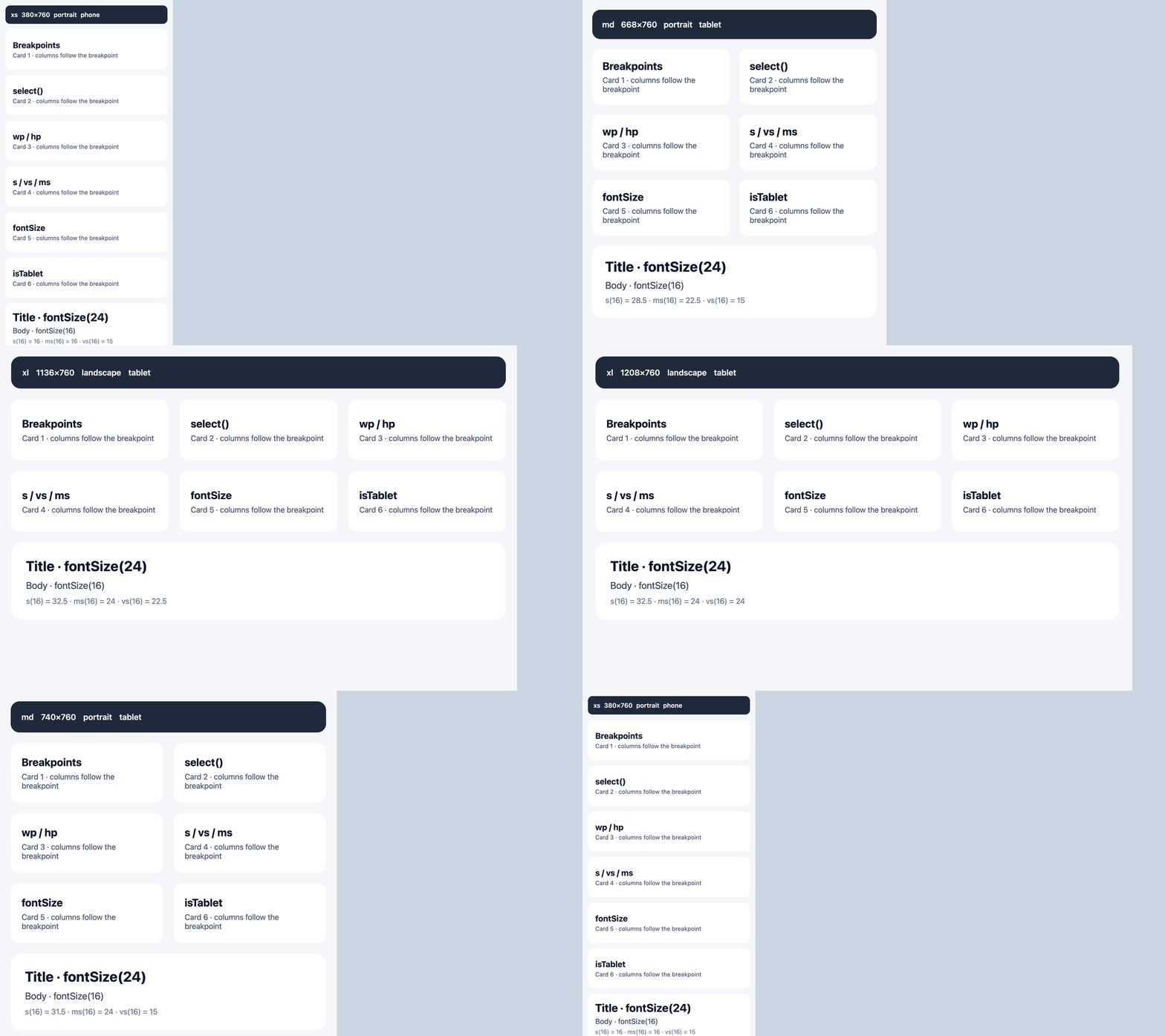
}The example app as the window gets wider: the grid goes from one column (xs) to two (lg) to three (xxl), and every size follows along.
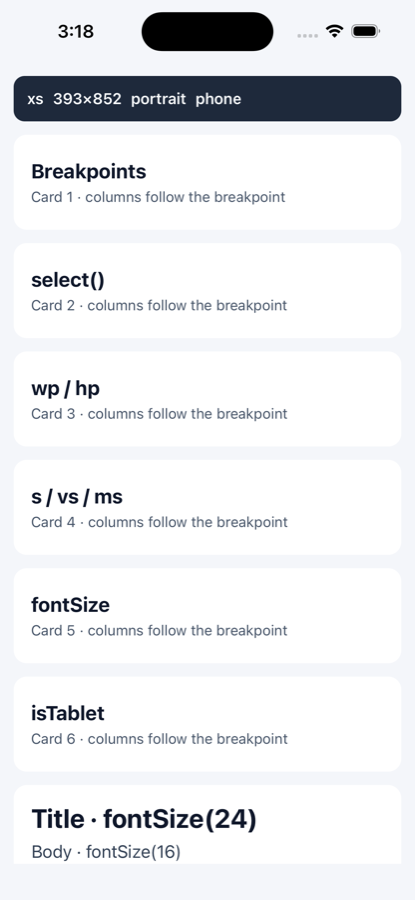
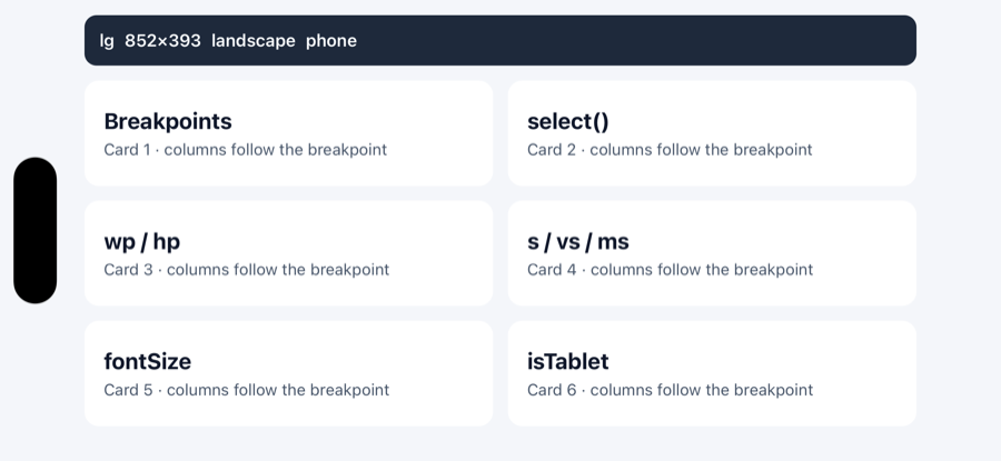
The same app on an iPhone 16 (iOS Simulator). Rotating switches it from xs with one column to lg with two, and the grid stays clear of the Dynamic Island.
| react-native-responsive-hook | react-native-size-matters | react-native-responsive-screen | |
|---|---|---|---|
| Updates on rotation / window resize | ✅ hook-based | ❌ computed once | |
Named breakpoints + mobile-first select() |
✅ | ❌ | ❌ |
| Font size capped for tablets and large OS text sizes | ✅ fontSize() |
❌ | ❌ |
wp / hp percentages |
✅ | ❌ | ✅ |
s / vs / ms / mvs scaling |
✅ | ✅ | ❌ |
| Configurable base device & breakpoints | ✅ ResponsiveProvider |
❌ | |
| TypeScript source, ESM + CJS | ✅ | types only | types only |
| Tablet detection | ✅ isTablet |
❌ | ❌ |
It's plain JavaScript with no native code, so it works in Expo Go, on the New Architecture and with react-native-web. The source is TypeScript, tests cover 100% of it, and every release is published with npm provenance.
You need React 16.8+ and React Native 0.61+, since the hook is built on useWindowDimensions.
For a longer walkthrough with examples, see my article Creating Responsive UIs in React Native Made Easy on Medium.
example/ is a small Expo app that runs against this repo. It shows the current breakpoint and window size, a card grid whose column count comes from select(), and a type scale. Rotate the device or resize the browser window and watch it change.
npm install && cd example && npm install && npx expo startnpm install react-native-responsive-hook
# or
yarn add react-native-responsive-hook
# or, in an Expo project
npx expo install react-native-responsive-hookimport { StyleSheet, View, Text } from 'react-native';
import { useResponsive } from 'react-native-responsive-hook';
const App = () => {
const styles = useStyles();
return (
<View style={styles.container}>
<View style={styles.box}>
<Text style={styles.text}>Adjusts to orientation, screen size, and platform.</Text>
</View>
</View>
);
};
const useStyles = () => {
const { isPortrait, wp, hp, fontSize, select, isIOS } = useResponsive();
return StyleSheet.create({
container: {
flex: 1,
alignItems: 'center',
justifyContent: 'center',
padding: select({ xs: 12, md: 24, xl: 48 }),
},
box: {
width: isPortrait ? wp(85) : wp(50),
height: hp(17),
borderWidth: 2,
borderColor: 'orange',
backgroundColor: select({
xs: 'lightgreen',
sm: 'lightpink',
md: 'lightyellow',
lg: 'lightcoral',
xl: 'lightskyblue',
xxl: 'lightsteelblue',
}),
},
text: {
fontSize: fontSize(16),
fontFamily: isIOS ? 'Helvetica' : 'Roboto',
},
});
};
export default App;Everything the hook returns is memoized on width, height, font scale and the ResponsiveProvider config. You can safely use these functions as useMemo dependencies or pass them to React.memo children.
breakpoint tells you which named breakpoint the current width falls in:
| Name | Width (dp) |
|---|---|
xs |
below 400 |
sm |
400 to <600 |
md |
600 to <768 |
lg |
768 to <1008 |
xl |
1008 to <1280 |
xxl |
1280 + |
Each breakpoint starts at its minimum width, so a fractional width like 399.5 (Android reports these) lands in the lower one. You can change the thresholds with ResponsiveProvider.
Returns the value for the current breakpoint. If there's no entry for it, it looks at the next smaller breakpoint, and so on down (mobile-first). After that it uses the default key, and if there isn't one it returns undefined.
select({ sm: 12, lg: 20 })
// xs  -> undefined
// sm  -> 12
// md  -> 12   (cascades down from sm)
// lg  -> 20
// xxl -> 20   (cascades down from lg)

select({ sm: 12, default: 8 })
// xs  -> 8
Only undefined counts as missing, so select({ sm: 0 }) gives you 0.
wp(percent): a percentage of the screen width, in dphp(percent): a percentage of the screen height, in dpvw(percent)/vh(percent): viewport units, rounded down
All four take either 50 or '50%'. If you pass something else, such as '', 'abc', '50vw' or NaN, you get the same value as before. In development (when __DEV__ is true) you also get a console warning, once per input and at most 20 in total. React Native's Jest preset sets __DEV__, so you may see these warnings in test runs too.
-
fontSize(size)scales with the shorter screen edge and also applies the user's OS text size (useWindowDimensions().fontScale). The device part is kept between 0.85× and 1.3× so tablets don't end up with huge body text, and the OS text scale is capped at 2×.Use it with
<Text allowFontScaling={false}>. By default React Native's<Text>already multipliesfontSizeby the OS text scale, so using both would scale twice (a 1.5× setting turns into about 2.25×). With native scaling off,fontSize()applies the OS scale once and keeps its 2× cap. If you'd rather keep React Native's native scaling, size your fonts withs()orms()and limit them withmaxFontSizeMultiplier. -
ms(size, factor = 0.5)is a moderate scale. It movesfactorof the way fromsizetowards full linear scaling with the shorter edge, soms(16)is 16 on the 375dp baseline and about 24.5 on a 768dp tablet. The formula is the same asmoderateScalein react-native-size-matters, but the baseline is 375dp instead of 350 and the result is rounded to the nearest pixel, so the numbers differ a little. To get closer to size-matters, setbaseDevice: { width: 350, height: 680 }onResponsiveProvider. Keep in mind thatbaseDeviceis shared, so this also changesfontSize,remandmsvalues. -
rem(size)scales linearly against a 375dp baseline. It doesn't apply the OS text size.
| This library | react-native-size-matters | Scales by |
|---|---|---|
s(size) |
scale / s |
shorter edge ÷ base width |
vs(size) |
verticalScale / vs |
longer edge ÷ base height |
ms(size, factor = 0.5) |
moderateScale / ms |
halfway (by factor) towards s |
mvs(size, factor = 0.5) |
moderateVerticalScale / mvs |
halfway (by factor) towards vs |
The difference from size-matters is that these come from the hook, so they update when the device rotates or the window is resized. They scale against the base device, which is 375 × 812 by default (size-matters uses 350 × 680), and round to the nearest pixel. You can match size-matters by setting baseDevice on ResponsiveProvider, with the same caveat as above: it also changes fontSize, rem and ms.
Call it once at module level, outside your components. It gives you back a hook. The styles are rebuilt only when the window size, font scale or provider config changes, so they follow rotation, and between those changes you get the same object back. Because of that, the factory should only use the helpers it's given. Anything that depends on props or context belongs in inline styles.
import { createResponsiveStyles } from 'react-native-responsive-hook';

const useStyles = createResponsiveStyles(({ wp, s, select, fontSize }) => ({
  card: {
    width: wp(90),
    padding: s(12),
    flexDirection: select({ xs: 'column', md: 'row', default: 'column' }),
  },
  title: { fontSize: fontSize(18) },
}));

function Card() {
  const styles = useStyles();
  return <View style={styles.card}>…</View>;
}
Style values are type-checked against React Native's own style types, and you don't need any casts.
react-native-responsive-hook/testing exports a provider that makes every useResponsive() and createResponsiveStyles hook inside it use a window size you pick. It's handy in Jest tests, Storybook stories and previews. You don't have to mock useWindowDimensions, which is awkward in newer React Native versions.
import { render } from '@testing-library/react-native';
import { MockWindowProvider } from 'react-native-responsive-hook/testing';

it('shows two columns on a tablet', () => {
  render(
    <MockWindowProvider width={1024} height={768}>
      <Dashboard />
    </MockWindowProvider>
  );
  // ...
});
fontScale is optional and defaults to 1. You can combine it with ResponsiveProvider, which still provides the config. It only changes what this library's hooks see. React Native's own Dimensions and useWindowDimensions, and the deprecated module-level exports, still report the real window.
isIOS, isAndroid, isLandscape, isPortrait and isTablet.
isTablet is true when the shorter side of the window is at least 600dp, the same rule Android uses for sw600dp, so rotating doesn't change it. It's based on the window rather than the physical screen. That means it can change in iPad Split View or Android multi-window, and on the web it's true for any browser window at least 600dp on its shorter side.
This is optional. Wrap your app in it to change the design baseline or the breakpoint thresholds for every useResponsive() inside:
import { ResponsiveProvider } from 'react-native-responsive-hook';

<ResponsiveProvider
  config={{
    baseDevice: { width: 390, height: 844 }, // what fontSize, rem, s, vs, ms and mvs scale against
    breakpoints: { md: 640, lg: 1024 },      // minimum widths; omitted keys keep their defaults
  }}
>
  <App />
</ResponsiveProvider>- Without a provider, the defaults above apply.
- Thresholds have to be positive and go up in order (
sm < md < lg < xl < xxl). In development an invalid config throws an error that names the problem key. In production (__DEV__false, orNODE_ENV=productionwhere__DEV__isn't defined) it logs the same error withconsole.errorand uses the defaults, so a bad config won't crash your users' app. If you raise one threshold past the next default, for examplesm: 700whilemdis still 600, set the ones above it as well. - You can pass the config as an inline object. The memoized values only change when the numbers do.
- A nested provider starts from the defaults. It doesn't inherit its parent's config.
initialWindow: { width, height, fontScale? }is the size to assume while React Native reports a 0×0 window. That happens during server-side rendering on the web (Expo Router, Next.js with react-native-web) and occasionally on a native first render. Without it you'd getxsand zero sizes. It stops being used as soon as the real window has a size, andfontScaledefaults to 1. On its own it only prevents a hydration mismatch for visitors whose window happens to match it, because react-native-web measures the real window on the client's first render.ssr: true(together withinitialWindow) prevents the mismatch for every visitor. The provider renders withinitialWindowuntil it has mounted, on the server and on the client's first render, and then switches to the real window. Visitors whose window is a different size will see the layout change once, right after the page loads.- It only applies on the web. On iOS and Android it's ignored, so you can leave it on in a shared Expo Router layout.
- It only applies to the first page load. Providers that mount later, for example after client-side navigation, use the real window straight away.
- It covers what
useResponsive()andcreateResponsiveStylesreturn, not directuseWindowDimensionscalls or the deprecated module-level exports. - Nested providers don't inherit it, so set
ssrandinitialWindowon them too.
- The deprecated module-level exports (
widthPercentageToDP, thebreakpointGroupconstant, and so on) can't read React context, so the provider has no effect on them.
1.1.0 and every later version are backwards compatible. Nothing has been removed, and no existing function returns something different, apart from the bug fixes listed below. The APIs in this table are deprecated but still work.
| Deprecated | Use instead | Notes |
|---|---|---|
rf(size) |
fontSize(size) |
Despite the name, rf never scaled with the screen. It just caps sizes at 32. That hasn't changed, so upgrading won't move your existing font sizes. |
breakpointGroup |
breakpoint |
group1…group6 map to xs…xxl in order. |
widthPercentageToDP / heightPercentageToDP |
wp / hp from the hook |
|
viewportWidthPercentage / viewportHeightPercentage |
vw / vh from the hook |
|
remUnit / responsiveFont |
rem / fontSize from the hook |
|
listenOrientationChange / removeOrientationListener |
useResponsive() |
The hook tracks dimensions for you. |
Module-level isLandscape / isPortrait / breakpointGroup |
the hook's equivalents | These are read once when the module loads and never update on rotation. |
- Fractional widths now resolve correctly. A width between two whole-number ranges, like
399.5dp (which Android can report), used to end up asxxl. It now goes to the lower breakpoint,xs. ANaNwidth also resolves toxsnow instead ofxxl.
- Importing the package no longer crashes. 1.0.4 read
isLandscapebefore declaring it, which threwReferenceError: Cannot access 'isLandscape' before initializationon Hermes. removeOrientationListenerworks. It used to callDimensions.removeEventListener, which React Native 0.72 removed, and even before that it passed a new function that didn't match anything, so nothing was removed.breakpointGroupno longer returnsundefinedabove 8192dp.- The published package went from 802 kB to about 25 kB (packed), because it no longer ships three example apps.
Contributions are welcome. Open a pull request, or email zakriamuhammad3637@gmail.com if you'd like to talk something through first.
npm install
npm test
npm run typecheck
npm run build