Repository navigation
feat(associations): honest logo fallback and a steadier accordion - #210
Merged
BIA3IA merged 14 commits intoNov 2, 2026
Merged
Conversation


Contributor
|
Important Review skippedAuto reviews are disabled on base/target branches other than the default branch. Please check the settings in the CodeRabbit UI or the
 |
This was referenced Oct 28, 2026

viganogabriele
marked this pull request as ready for review
October 31, 2026 17:54

BIA3IA
force-pushed
the
feat/associations-visual-refinement
branch
from
November 2, 2026 13:53
15232a3 to
a60acbb
Compare
BIA3IA
force-pushed
the
feat/matricole-visual-refinement
branch
2 times, most recently
from
November 2, 2026 14:06
6917b00 to
3e84d00
Compare
BIA3IA
force-pushed
the
feat/associations-visual-refinement
branch
from
November 2, 2026 14:06
a60acbb to
4c9461a
Compare
BIA3IA
force-pushed
the
feat/matricole-visual-refinement
branch
from
November 2, 2026 14:20
3e84d00 to
ca0ab5c
Compare
BIA3IA
force-pushed
the
feat/associations-visual-refinement
branch
2 times, most recently
from
November 2, 2026 14:32
2deef4c to
7da2add
Compare
BIA3IA
force-pushed
the
feat/matricole-visual-refinement
branch
from
November 2, 2026 14:32
ca0ab5c to
30dbd99
Compare
BIA3IA
force-pushed
the
feat/associations-visual-refinement
branch
2 times, most recently
from
November 2, 2026 14:56
e39b2dc to
e1d628d
Compare
BIA3IA
force-pushed
the
feat/matricole-visual-refinement
branch
from
November 2, 2026 14:56
00e2654 to
aa7f521
Compare
BIA3IA
force-pushed
the
feat/associations-visual-refinement
branch
from
November 2, 2026 15:00
e1d628d to
e3e2508
Compare
BIA3IA
force-pushed
the
feat/matricole-visual-refinement
branch
2 times, most recently
from
November 2, 2026 15:02
5df0b9e to
9704412
Compare
BIA3IA
force-pushed
the
feat/associations-visual-refinement
branch
2 times, most recently
from
November 2, 2026 15:14
52640bf to
c83b028
Compare
BIA3IA
force-pushed
the
feat/matricole-visual-refinement
branch
2 times, most recently
from
November 2, 2026 15:18
4cd1a9a to
9c83b71
Compare
BIA3IA
force-pushed
the
feat/associations-visual-refinement
branch
from
November 2, 2026 15:19
c83b028 to
6ac92c4
Compare


…rd grid

- Page uses the shared container, title/lead styles and vertical rhythm of
  the other redesigned pages instead of ad-hoc paddings and a 1616px
  breakpoint.
- Email cards: four in a row from xl as in Figma, 2×2 below, one column on
  phones, so a card is never left alone on a row; cards size to content
  instead of the fixed 264×312 box.
- "Trova il tuo gruppo" had no action: it now links to /groups, like the
  inline link in the same paragraph.
- Group photo keeps Figma's crop next to the text from xl and is capped
  when stacked; text is left-aligned at every width.

Co-Authored-By: Claude Opus 5.5 <noreply@anthropic.com>
- The group photo is 512x246: it was declared 721x342 and stretched up to
  768px wide. It now shows at its real size at most.
- "Candidature" linked to /join with the label "Struttura"; the label now
  matches the page it opens.
- The inline links use INLINE_LINK, with a visible focus ring.
BIA3IA
force-pushed
the
feat/associations-visual-refinement
branch
from
November 2, 2026 15:26
6ac92c4 to
ed94238
Compare
BIA3IA
force-pushed
the
feat/matricole-visual-refinement
branch
from
November 2, 2026 15:26
9c83b71 to
7df8918
Compare
…search

- One ProjectCard for the three lists: the project's logo replaces Figma's
  placeholder icons (crop / upload), the title gets a per-line gradient, and
  the footer says what the project page offers (web app or source code).
- One ProjectList: cards in a min/max-bounded auto-fill grid instead of
  fixed 312x264 boxes at fixed breakpoints; on phones a carousel with the
  next card peeking in.
- The collection search box now filters by name and description (it had no
  handler), with an explicit "no match" state.
- Empty lists render a dashed placeholder that points to "Hai un'idea?".
- "Hai un'idea?" sits as text + two reference cards side by side, with a
  readable lead and a real mailto link.
- /projects and /projects/[id] use the shared container, titles and
  rhythm; the detail page drops its gradient panels and closes on the
  background like the other pages.

Co-Authored-By: Claude Opus 5.5 <noreply@anthropic.com>
- ProjectCard is now a CardCaption with a logo, a clamped caption and
  a footer, instead of a second copy of its link, hover, focus and
  footer logic. CardCaption gains `image`, `titleClassName` and
  `captionClassName` for it.
- The search looks through every project on the page, novelties and
  deprecated ones included, matches each word separately and announces
  the number of results.
- PeekCarousel replaces the two copies of the phone carousel (homepage
  and project lists).
- SECTION_STACK moves to layout/page and also serves /about.
- t.me links are labelled Telegram, not Web.
- The project page shows no placeholder icon when there is no logo, and
  "Hai un'idea?" sits on the container's left edge like the other
  sections.
- Long search queries wrap inside the empty state.
…with any project

CardCaption draws its title gradient per line, as ProjectCard did before
it moved onto CardCaption: a wrapped title no longer fades on its second
line. The search box shows whenever the page has projects to search,
not only when the collection itself has some.
- Results and extra pages: one ~1024px column (Figma's list width) with a
  shared header component (back, centred title, close) laid out on a
  three-column grid, so long course names no longer run under the buttons
  on phones.
- The general groups (site, school, level, course) were squeezed four per
  row with their names overlapping the platform buttons; they now sit one
  per row, two per row from lg, as in Figma.
- Group rows: name and buttons share a row; when the card is narrower than
  20rem the name gets its own line instead of breaking word by word. The
  `stacked` variant is gone.
- Hover only where there is a link: the platform buttons darken, the report
  flags darken, course rows lighten and nudge their chevron, the landing
  cards get the identity hover. Keyboard focus rings on all of them.
- Wizard: no wasted 16px inset on phones, where the glass panel is
  invisible, so the step labels fit at 320px.
- Landing title uses the fluid display size and is the page's h1.

Co-Authored-By: Claude Opus 5.5 <noreply@anthropic.com>
…offline

- The four actions in a group row are 6px apart on phones too: 2px left
  the WhatsApp link and its report flag too easy to mistake.
- The general groups get a visually hidden heading, so the outline no
  longer jumps from h1 to h3.
- getVisibleGroups returns an empty list when the backend fails, like
  the other queries, so /groups/extra shows its empty state instead of
  a 500.
CardIcon's responsive `size` ({ base, sm, md, lg }) builds "sm:…" classes at
runtime, so Tailwind never generated the ones not written literally elsewhere
(e.g. sm:px-8 for the homepage material shortcuts). Generate every prefixed
variant of the size maps with @source inline(), and add a test that fails if
classes.ts gains a class missing from that list.

Co-Authored-By: Claude Opus 5.5 <noreply@anthropic.com>
…rids

- Hero, sections and FAQ use the shared container, hero offset, rhythm and
  section titles; the featured resources close the hero.
- "Guide e Utility" is a section title (it was 22px on phones, smaller than
  the Telegram Hub card title) and sits closer to its own content.
- Large resource cards: descriptions capped at 448px instead of 240px.
- The large guide sits beside the 2x2 small guides only from xl, on a 5/7
  split repeated by Materiali / Tech Tools, so "Mappa Microonde" no longer
  wraps; the four small guides use 20px titles.
- Telegram Hub: two columns until xl (four columns clipped "Mercatino" at
  1024px); the group has 24px padding on phones instead of 48px, so its
  links span the width as in the Figma mobile frame.
- Resources with a link react to hover, the others don't.
- Resources hidden on phones stay hidden: that's the Figma mobile frame,
  an open design decision.

Co-Authored-By: Claude Opus 5.5 <noreply@anthropic.com>
- The school tiles of the groups wizard use the sm size on phones, now
  that responsive CardIcon sizes are generated: at 320px they were about
  400px tall each.
- Materiali and Tech Tools sit side by side from lg: below xl the
  full-width card left half its width empty.
- CardIcon's hover defaults to whether the card has an href, so callers
  no longer repeat Boolean(href).
- The intro uses PAGE_HERO_TOP instead of cancelling PAGE_HERO's bottom
  padding at every breakpoint.
- Associations without a logo show their initials instead of ESN's logo,
  which came from the Figma example; the unused placeholder asset is gone.
- Page on the shared container, hero and rhythm; the list keeps Figma's
  1200px column.
- Accordion: constant padding open or closed (the name no longer jumps),
  description aligned with the name from md and capped at a readable
  measure, names at 20/22/28px instead of 22/45px, smaller logos on phones.
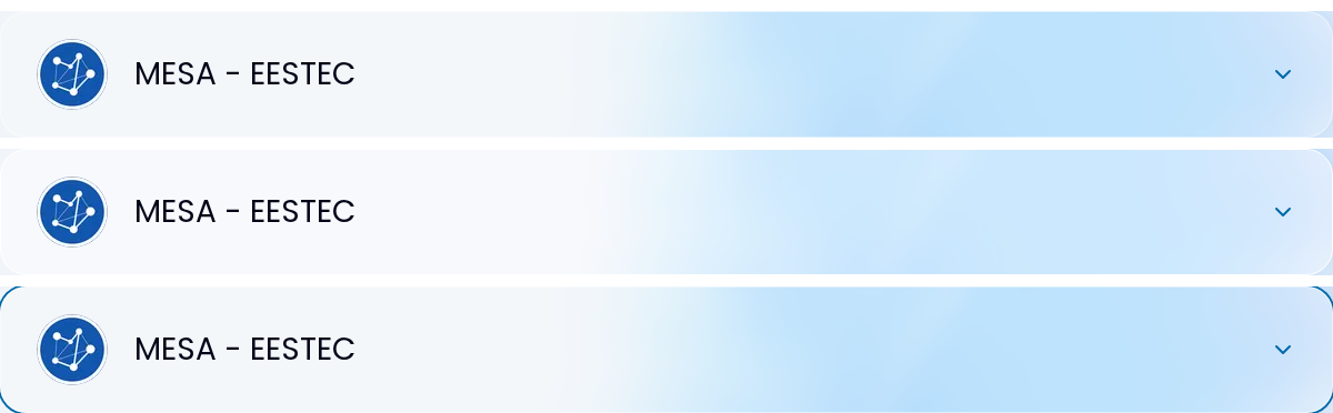
- The clickable header brightens on hover and rings the item on keyboard
  focus; social links get accessible names, 40px targets and rel=noopener;
  "Segui l'associazione" drops its blue gradient and only shows with links.
- Empty or unreachable list: a dashed placeholder like /projects.
- Shared Hero: the title size is capped so its longest word fits the
  content width; "Associazioni" and "Contattaci" overflowed phones and
  tablets. Titles that already fit keep the Figma sizes.
- /about association bodies keep their look on the new accordion padding.

Co-Authored-By: Claude Opus 5.5 <noreply@anthropic.com>
This PR sets the title size on Hero's inner span, so /storia's
[&_h2]:typo-display-fluid-extralarge override stopped having any effect.
It is removed, and the description width /storia needs goes through a
new descriptionClassName prop. Hero's comments are cut to the reason
behind the size cap.
BIA3IA
force-pushed
the
feat/matricole-visual-refinement
branch
from
November 2, 2026 15:28
7df8918 to
56a596e
Compare
BIA3IA
force-pushed
the
feat/associations-visual-refinement
branch
from
November 2, 2026 15:28
ed94238 to
0c68c21
Compare
Base automatically changed from
feat/matricole-visual-refinement
to
feat/home-visual-refinement
November 2, 2026 15:54
This file contains hidden or bidirectional Unicode text that may be interpreted or compiled differently than what appears below. To review, open the file in an editor that reveals hidden Unicode characters.
Learn more about bidirectional Unicode characters
Sign up for free
to join this conversation on GitHub.
Already have an account?
Sign in to comment


Add this suggestion to a batch that can be applied as a single commit.This suggestion is invalid because no changes were made to the code.Suggestions cannot be applied while the pull request is closed.Suggestions cannot be applied while viewing a subset of changes.Only one suggestion per line can be applied in a batch.Add this suggestion to a batch that can be applied as a single commit.Applying suggestions on deleted lines is not supported.You must change the existing code in this line in order to create a valid suggestion.Outdated suggestions cannot be applied.This suggestion has been applied or marked resolved.Suggestions cannot be applied from pending reviews.Suggestions cannot be applied on multi-line comments.Suggestions cannot be applied while the pull request is queued to merge.Suggestion cannot be applied right now. Please check back later.
Part of the stacked visual-refinement series. Base is #209 (
/matricole); merge after it. This PR covers/associations(Figma desktop2306:5313, mobile3498:2836) and one shared fix toHero.What changes
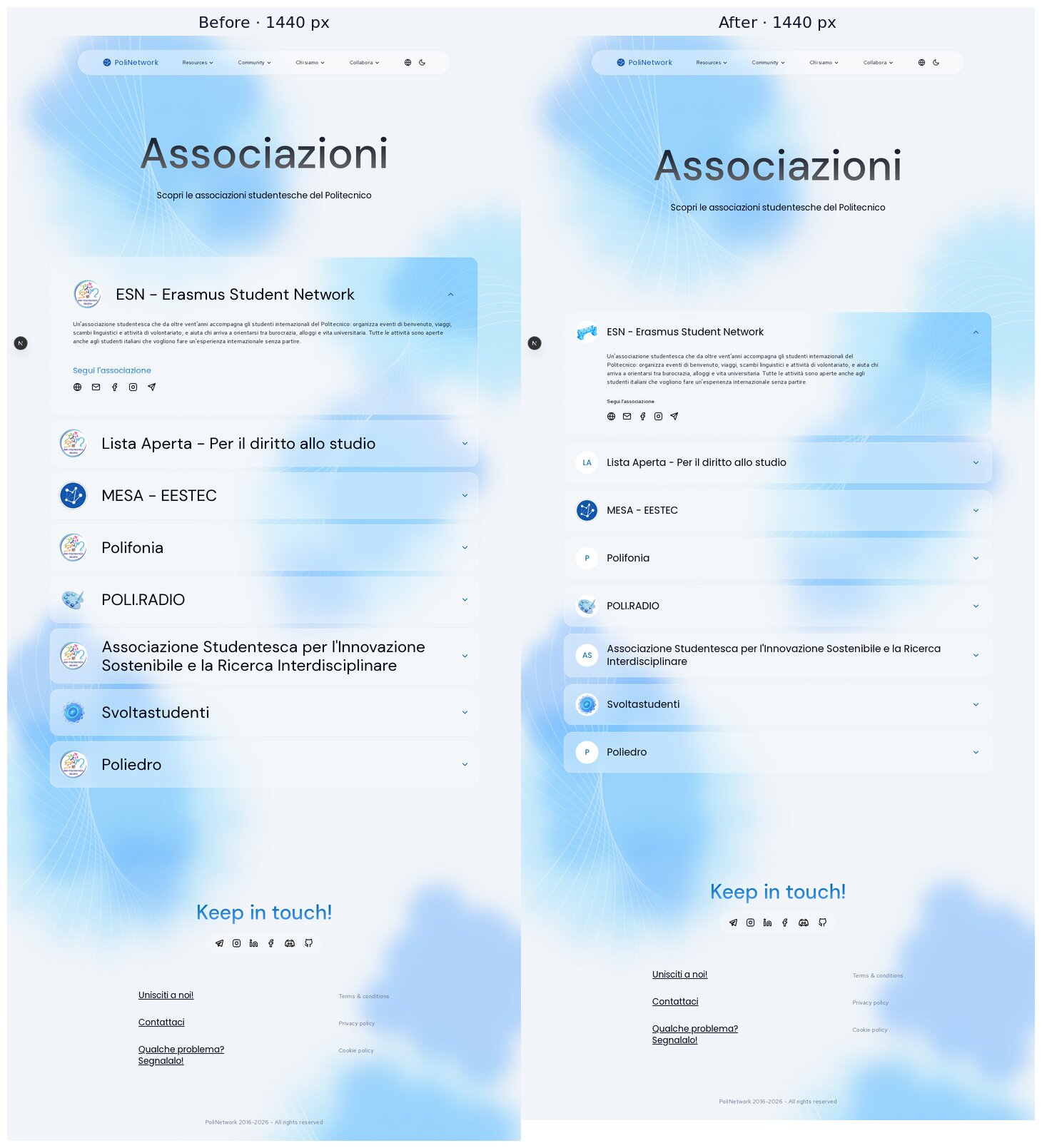
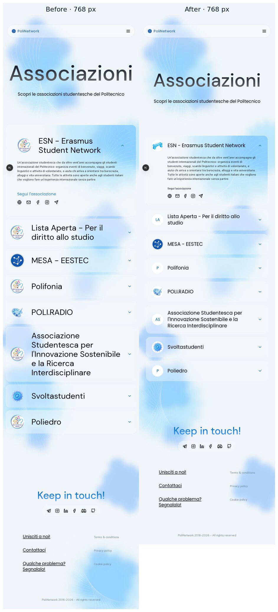
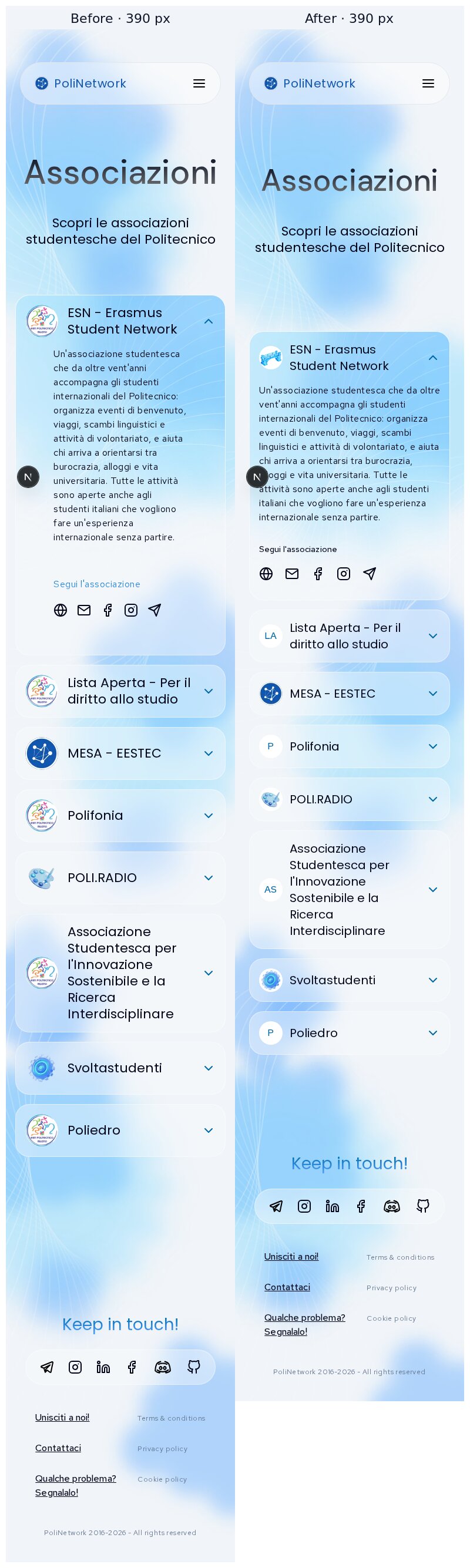
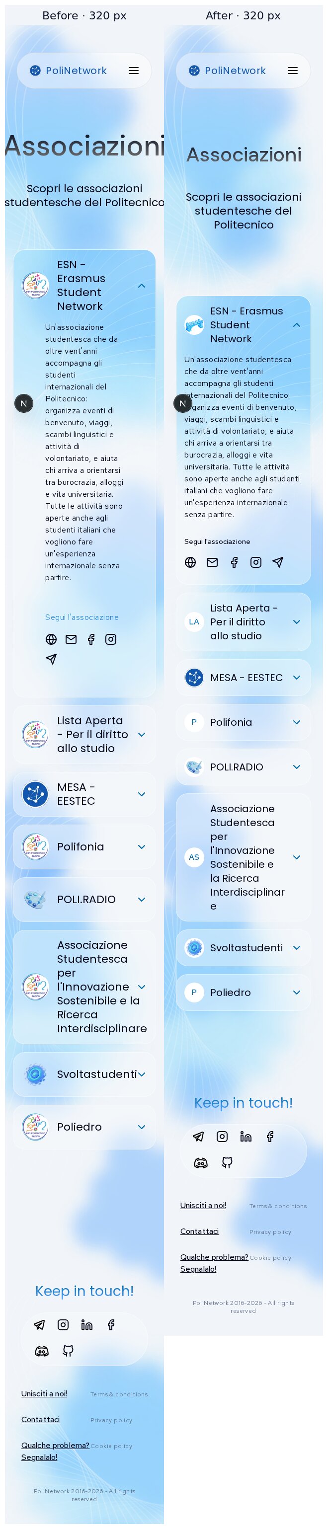
Logos are honest
associations-list.tsxfell back to the logo from the Figma example (audit R10).public/logos/esn.svgis removed.alt="") because the name is right next to them.Accordion
md, all Poppins. Before it was 22 px, then 45 px frommd; at 768 px the longer names wrapped onto three lines.mdit lines up with the name;max-w-3xl);rel="noopener noreferrer"and a focus ring.outline-noneand no visible focus at all.Page
layout/page.ts, and the list keeps Figma's 1200 px column.[]for both), the page shows a dashed placeholder with the same style as/projects. Before it was a line of small text in a large empty area.Shared:
Herotitle fits its longest wordmin(Figma size, (100vw − gutters) / (letters × 0.55em)).Shared changes and their reach
ui/hero.tsx: title capped to fit its longest wordHero, only at widths where a long word would overflow (table above). Page heights at 320/390/768/1440 are identical on/collabora,/matricole,/team,/join,/projects,/about,/faqsand/guides;/contactat 320 is +2 px.accordion-association/*: padding, typography, hover/focus/about"Organi associativi" on phones.association-bodies.tsxnow passes its padding and title size explicitly, so it renders as before (screenshot below, heights identical).Screenshots
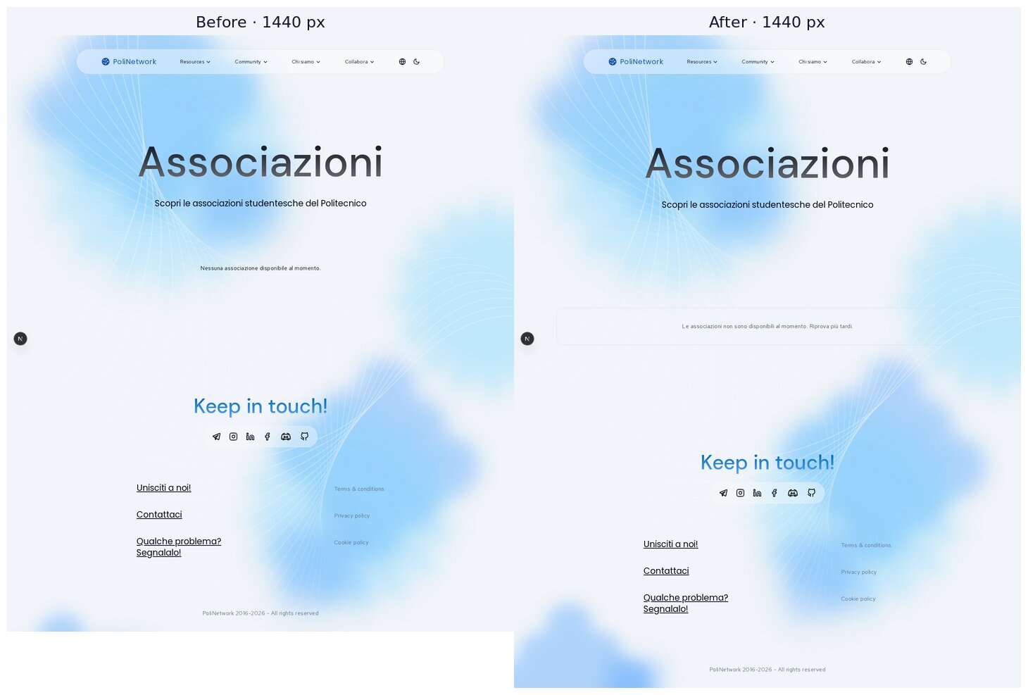
Locally the backend is unreachable, so the "before" and "after" lists come from the same temporary fixture: 8 associations with and without logos, a very long name, a long description, and one item without links. The fixture was not committed. The one difference: the first item's "before" logo is the removed
esn.svg.Desktop 1440
Tablet 768
Mobile 390 and 320
Empty / unreachable list (1440)
Idle → hover → keyboard focus
/aboutassociation bodies on mobile, before | after (unchanged)Verification
pnpm check: clean.pnpm build: passes.pnpm typecheck: clean.node --test tests/*.test.mjs: 3/3 pass./associationswas checked at 320, 390, 768, 1024, 1279, 1280, 1440, 1728 and 1920 px, with no horizontal overflow.Trade-offs
overflow-wrap: break-word) rather than run under the chevron. With the fixture this never triggers at 320 px.Deliberately left out
descriptionEn) waits on the language switch, which is an open decision.Housekeeping
The screenshots live on
pr-assets/associations-visual-refinementso the diff stays code-only; delete that branch after review.🤖 Generated with Claude Code