Repository navigation
feat(team): calmer team sections with non-interactive specialisms - #203
Merged
Merged
Conversation


Contributor
|
Important Review skippedAuto reviews are disabled on base/target branches other than the default branch. Please check the settings in the CodeRabbit UI or the
 |
This was referenced Oct 27, 2026

viganogabriele
marked this pull request as ready for review
October 31, 2026 17:54

BIA3IA
force-pushed
the
feat/team-visual-refinement
branch
from
November 2, 2026 13:53
6e5b276 to
468a241
Compare
BIA3IA
force-pushed
the
feat/struttura-visual-refinement
branch
2 times, most recently
from
November 2, 2026 14:20
0543571 to
bfde305
Compare
BIA3IA
force-pushed
the
feat/team-visual-refinement
branch
2 times, most recently
from
November 2, 2026 14:32
7dc7607 to
f09cd4c
Compare
BIA3IA
force-pushed
the
feat/struttura-visual-refinement
branch
from
November 2, 2026 14:32
bfde305 to
85a1cb3
Compare


- Hero: Figma's centred XL title (fluid) with the two anchor actions; the
  rotated portrait collage and floating "200+" chip are gone (the board
  portraits already appear under "I nostri direttivi").
- "Come è nato tutto": the two 2016/2022 cards that repeated the timeline
  right below are removed; the text stands alone until the archive photo
  Figma reserves exists.
- Timeline: nodes on a line (vertical below lg, horizontal from lg) instead
  of four hoverable glass cards; the year is the link to its chapter.
- Chapters: numeral in the margin and one continuous vertical rule across
  all six; diagrams drawn without containers (icon chains, 5 → ~25 → 4,
  before → after columns, status list) instead of stacks of glass cards.
- No hover on things that are not links (board portraits, the closing
  statement); "L'obiettivo è raggiunto" is a statement, not a card.
- Projects note, thanks list, board summary and "La storia continua" lose
  their glass panels; the closing gradient panel and the filled "?" pill
  (which read as a button) become years on a line with an open slot.
- One container for every section (Figma's 1272px column, 24/40/64px
  gutters) and left alignment at every width for this long reading page.

Co-Authored-By: Claude Opus 5.5 <noreply@anthropic.com>
Each milestone carries its own anchor and icon instead of two arrays
kept in step by position. The chapter numeral column is 3rem, wide
enough for "02" at 36px. The closing statement is a div: a figure
without a caption has no meaning here.
Improve the page where Figma v1 (implemented) and v2 agree, without
switching to v2, which is still an open design decision.

- Hero: drop the two CTAs (in neither version), add the "La nostra
  visione" label both versions use, same top spacing as /storia.
- Il problema: questions become compact non-interactive chips (icon first)
  in a 5/7 rail, instead of three tall button-like cards.
- I numeri: figures at headline size beside the icon (they were 45px and
  outranked the section titles).
- Da dove veniamo / Come siamo organizzati and Sostieni: free columns on
  the background; no glass cards holding section titles, no nested panel,
  no 57px "5x1000" and 36px tax code.
- One container, gutters and title/lead roles shared with /storia and
  the homepage; text left-aligned on mobile.

Co-Authored-By: Claude Opus 5.5 <noreply@anthropic.com>
The history blocks use SECTION_TITLE like every other section on the
page. The #cosa-facciamo anchor lost its only link in this PR, so it
goes too.
…igma

- One OrganizationDiagram shared by /about and /storia instead of two
  copies. Nodes follow Figma's "Nodo organigramma" (glass tile, icon above
  a 22px label, 1px connectors); no CardIcon className overrides.
- Mobile chart follows Figma's vertical "Sezione organigramma": team leads
  hang off a rail, Membri Team balances the admin column.
- Soci box gets Figma's "Ruolo trasversale" tag and shares the chart's
  column width.
- Board portraits no longer lift on hover (they are not links); the mobile
  carousel bleeds to the edge so the next portrait peeks in.
- "Come funziona" and "Trova il tuo posto": plain text-primary titles as in
  Figma, no icon on the definitions.
- Same container as /storia and /chi-siamo; the closing title uses the
  grey gradient (style guide: decorated background or coloured text).

Co-Authored-By: Claude Opus 5.5 <noreply@anthropic.com>
…ortrait card

- Mobile chart: the stem under Team growth now turns left and meets the
  rail the team leads hang from; before it stopped in mid-air.
- Node takes a `fill` flag instead of six call sites cancelling its
  min-width and padding.
- The chart's accessible label lists the teams from teamLeads.
- BoardMemberCard replaces the two copies of the Direttivo portrait in
  /about and /storia.
- Comments that narrated Figma or the change are removed; the xl
  overlap on /storia gets one explaining why.
BIA3IA
force-pushed
the
feat/struttura-visual-refinement
branch
from
November 2, 2026 14:35
85a1cb3 to
b3fd927
Compare
BIA3IA
force-pushed
the
feat/team-visual-refinement
branch
from
November 2, 2026 14:35
f09cd4c to
3fdb87a
Compare
/storia, /chi-siamo and /about each defined the same content column and
section title classes. They now come from components/layout/page. The two
TextOnlyLayout sections in /storia keep their md:px-10 override explicitly;
layouts are unchanged.

Co-Authored-By: Claude Opus 5.5 <noreply@anthropic.com>
- Specialisms are a plain icon + label list on hairlines instead of
  button-like pills: they are not links, and which of Figma's four tile
  variants becomes standard is still open.
- Figma's alternating composition: text left, right for HR, and title and
  text side by side with the specialisms underneath for Events.
- More space between teams on desktop, shared container and title styles,
  descriptions at the section-lead size, left-aligned on every width.
- The closing call to action sits on the background instead of a panel
  with its own gradient.

Co-Authored-By: Claude Opus 5.5 <noreply@anthropic.com>
…ing CTA

- Every hand-written copy of SECTION_TITLE and SECTION_LEAD now uses the
  token, so all section titles change size at the same breakpoint
  (/about's closing title switched at md instead of sm).
- The homepage sections use CONTAINER like every other page, so their
  edges line up with the footer and the rest of the site.
- ClosingCta replaces the two copies of the closing call to action on
  /about and /team.
- TextOnlyLayout drops its px-6 md:px-36 padding, which every caller
  cancelled; /storia no longer needs md:px-10 to undo it.
- Comments that narrated Figma or the change are removed.
BIA3IA
force-pushed
the
feat/team-visual-refinement
branch
from
November 2, 2026 14:56
3fdb87a to
2840f5c
Compare
Base automatically changed from
feat/struttura-visual-refinement
to
feat/home-visual-refinement
November 2, 2026 14:57
BIA3IA
force-pushed
the
feat/home-visual-refinement
branch
from
November 2, 2026 15:00
e51e6bf to
b10fcbf
Compare
This file contains hidden or bidirectional Unicode text that may be interpreted or compiled differently than what appears below. To review, open the file in an editor that reveals hidden Unicode characters.
Learn more about bidirectional Unicode characters
Sign up for free
to join this conversation on GitHub.
Already have an account?
Sign in to comment


Add this suggestion to a batch that can be applied as a single commit.This suggestion is invalid because no changes were made to the code.Suggestions cannot be applied while the pull request is closed.Suggestions cannot be applied while viewing a subset of changes.Only one suggestion per line can be applied in a batch.Add this suggestion to a batch that can be applied as a single commit.Applying suggestions on deleted lines is not supported.You must change the existing code in this line in order to create a valid suggestion.Outdated suggestions cannot be applied.This suggestion has been applied or marked resolved.Suggestions cannot be applied from pending reviews.Suggestions cannot be applied on multi-line comments.Suggestions cannot be applied while the pull request is queued to merge.Suggestion cannot be applied right now. Please check back later.
Stacked on #202 (
feat/struttura-visual-refinement) ← #201 ← #200 ← #199. Review and merge in that order. This diff shows only this step.Visual pass on
/team(Figma desktop5546:10874, mobile5317:11658), plus a small shared refactor the previous pages needed.What changes
1. Shared page constants (refactor, no visual change).
/storia,/chi-siamoand/abouteach defined the sameCONTAINER(and/chi-siamoalsoSECTION_TITLE/SECTION_LEAD). They now come from one module,src/components/layout/page.ts, which/teamalso uses./storiasections rendered throughTextOnlyLayoutkeep theirmd:px-10override explicitly.2.
/teamxl).xl(was 144) and the hero matches/about's spacing. With the same content, the page grows from 3726 to 3953 px at 1440. It's still far from Figma's 9511 px, because the missing sections (see below) account for most of that./chi-siamo. Text is left-aligned at every width; it used to be centred on mobile and left-aligned on desktop./about. Previously it was a glass panel with its own blue gradient. The CTA still opens the application email (a real action).Shared changes and their reach
components/layout/page.ts(CONTAINER,SECTION_TITLE,SECTION_LEAD) replaces the per-page copies/storia,/chi-siamo,/about: no visual change (verified)CardIconis no longer used on/team; the component itself is untouched.Screenshots
All captures are full pages.
Desktop 1440
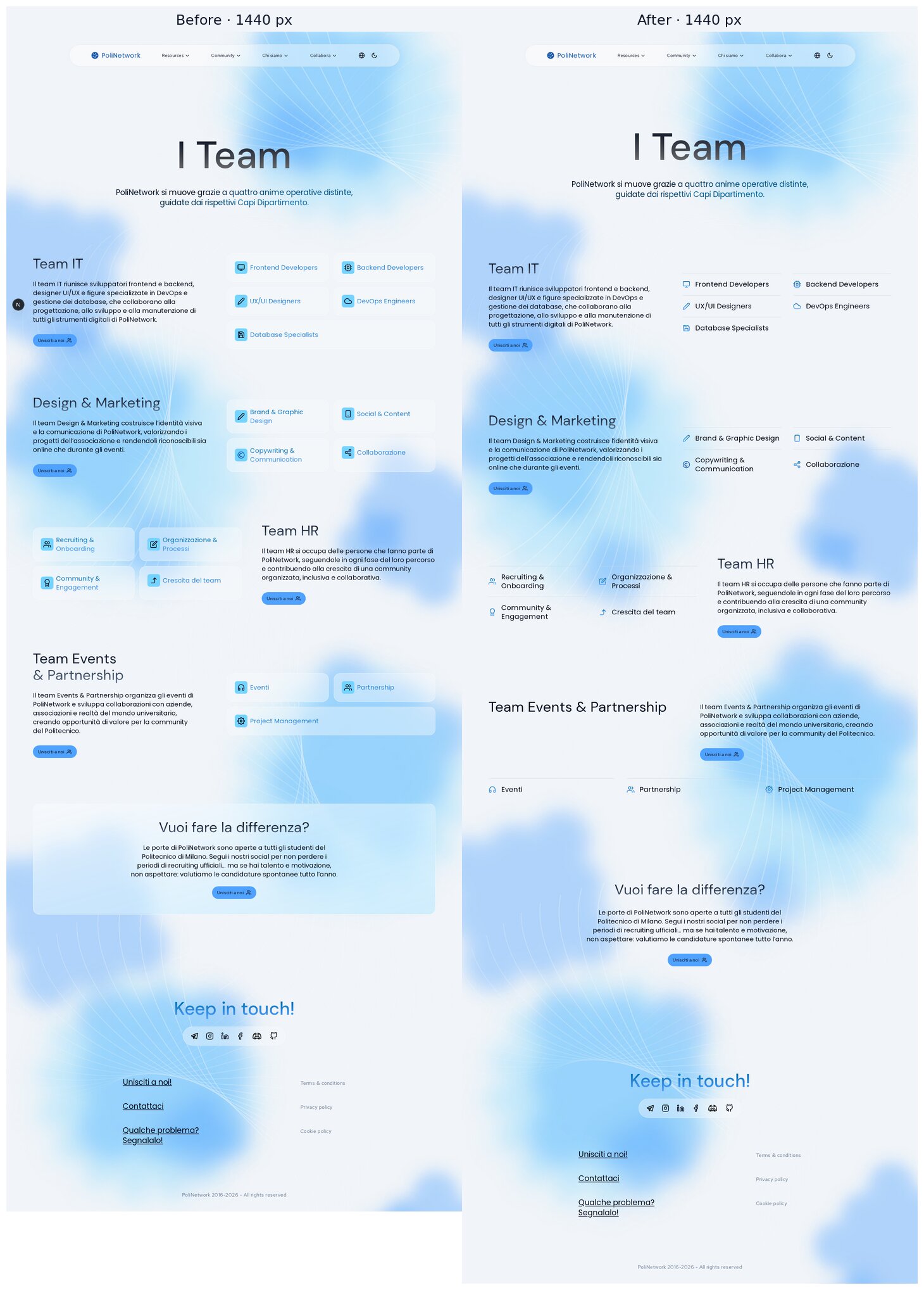
Desktop 1280
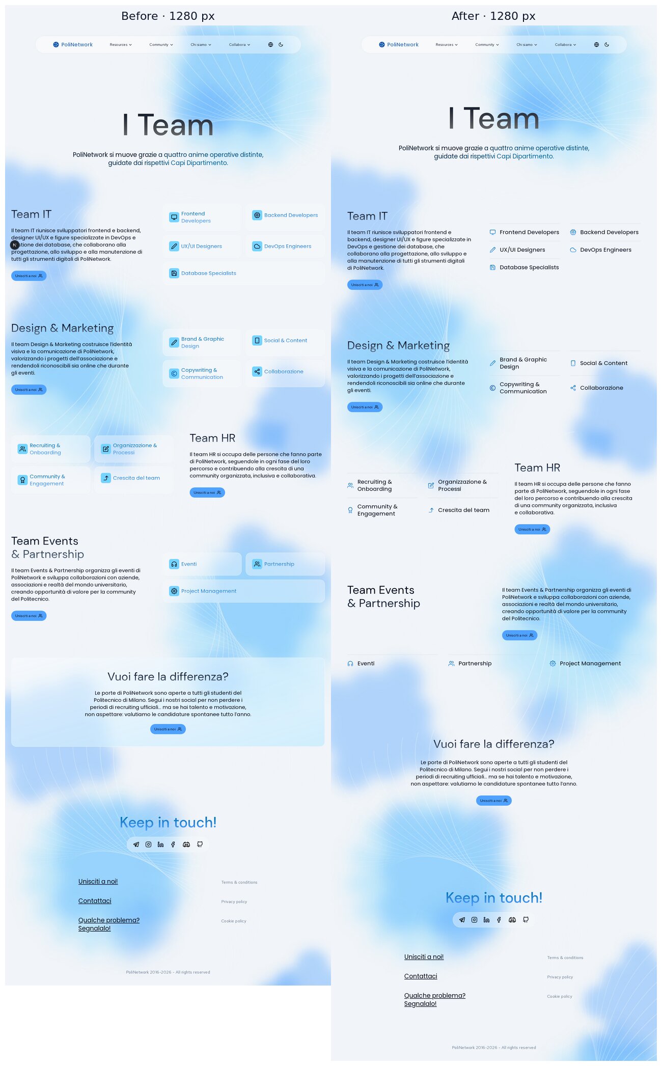
Tablet 1024
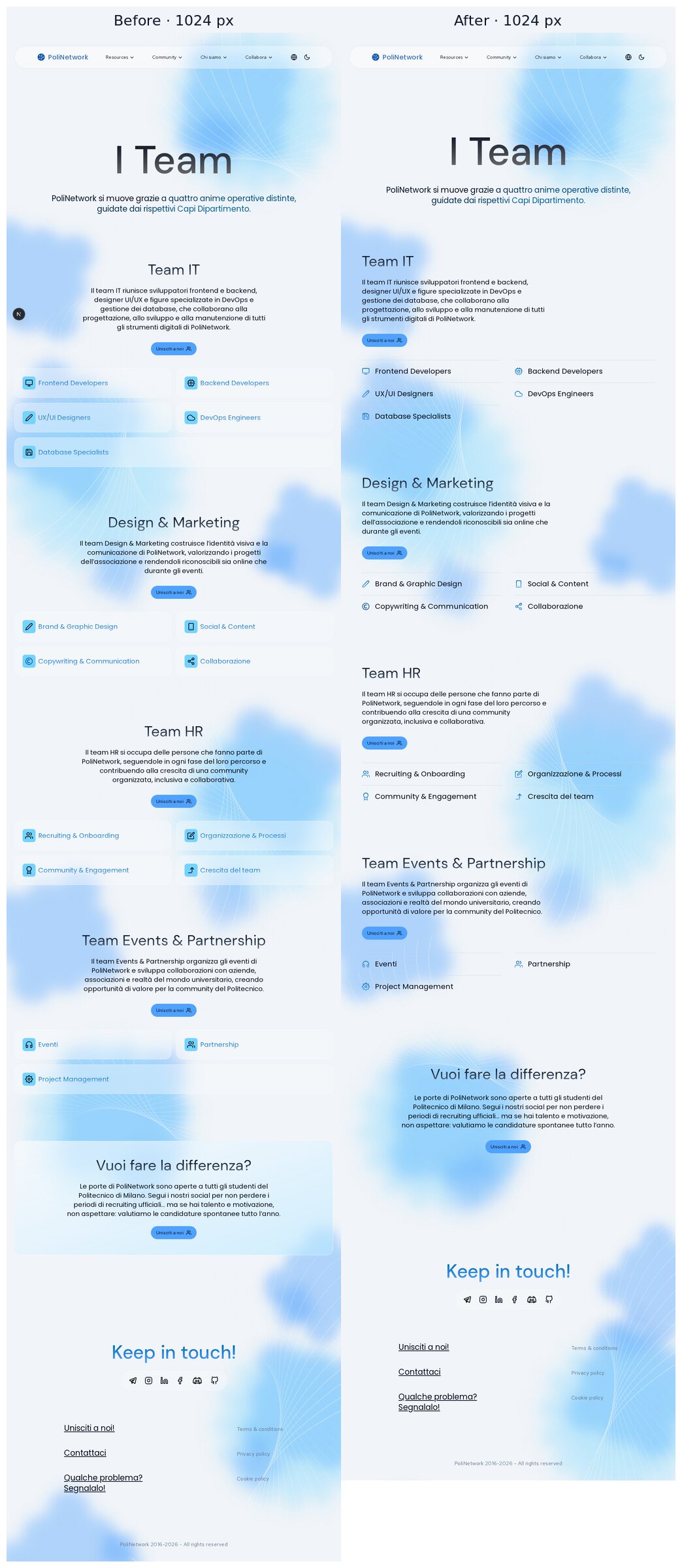
Mobile 390

Figma reference (

5546:10874)Verification
pnpm checkis clean.pnpm buildpasses.pnpm typecheckis clean.node --test tests/*.test.mjspasses (2/2)./teamwas checked in the browser at 320, 390, 768, 1024, 1279, 1280, 1440, 1728 and 1920 px (production build for the final pass). There is no horizontal overflow.Trade-offs
xl(1280 px). Below it, every team is text above the list. From 1280 px the alternating side-by-side layout starts.Deliberately left out (open decisions or missing content)
/aboutlists five teams including International. The copy needs an editorial decision.Housekeeping
The screenshots live on the orphan branch
pr-assets/team-visual-refinement. Delete it after review.🤖 Generated with Claude Code